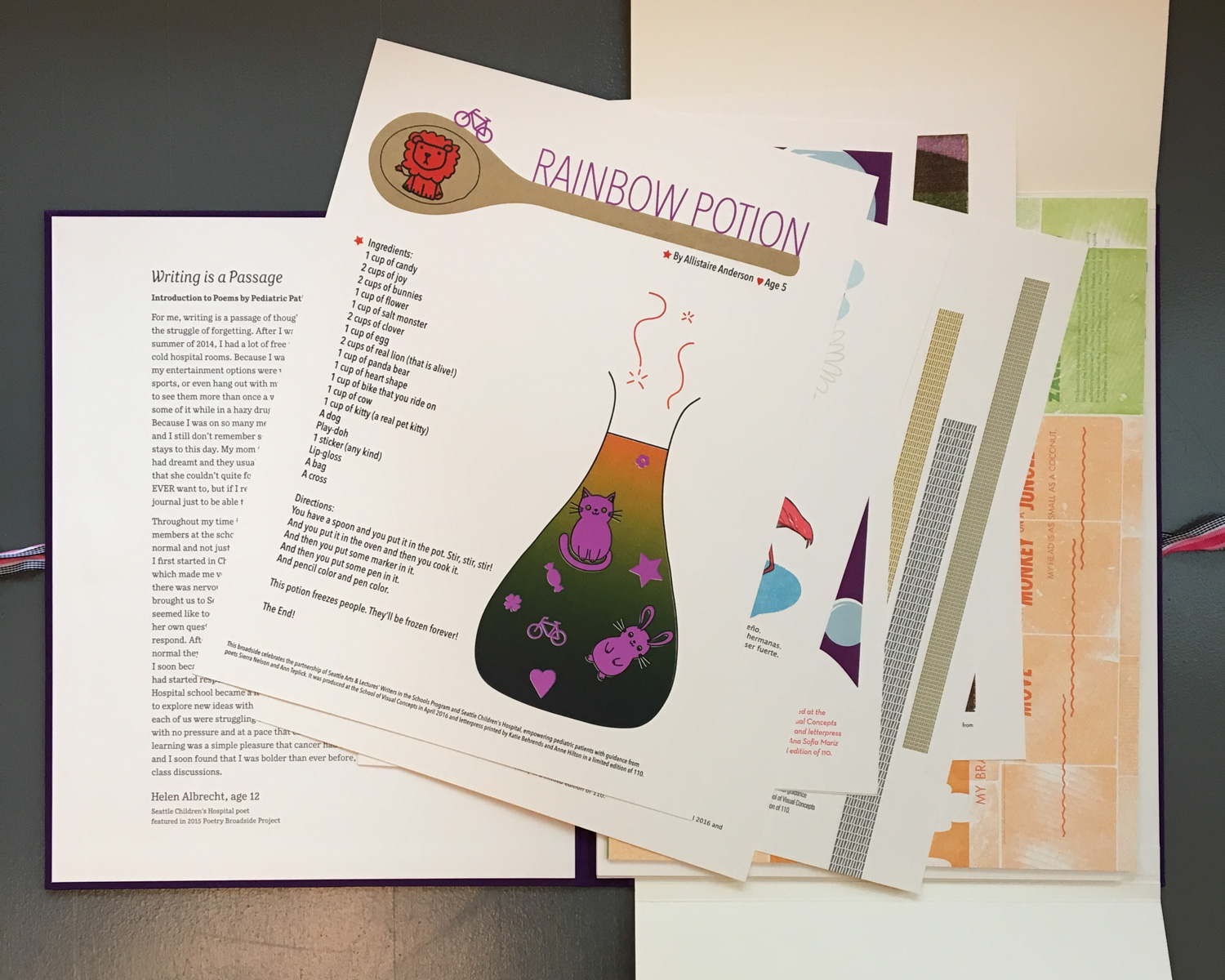
Now in its sixth year, this project is a partnership between letterpress printers from the School of Visual Concepts and the Seattle Arts and Lectures’ Writers in the Schools (WITS) program. WITS poets Sierra Nelson and Ann Teplick regularly work with pediatric patients at Seattle Children’s Hospital, helping the young patients write poetry that expresses their individual experiences.
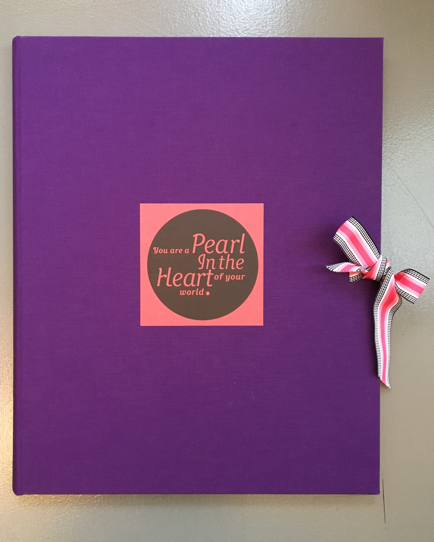
Once a year a select group of poems are chosen to be part of this project. This year 23 poems were matched with letterpress printers who created broadsides then bound in a portfolio.
I received a reflective and powerful poem by a 16-year old named Mackenzie who worked with poet Ann Teplick. For Mackenzie, her family, and anyone else interested in this program, what follows is the process of how I printed the broadside for this poem.
I was struck by the earthquake imagery in the poem. It made me think I could do something with shifting plates of earth or seismographs. After weighing several options I was excited about the thought of using these metal type ornaments. I like that they look a bit like layers of earth and thought I could put something together that imitated seismic faults, albeit in an abstract way.

I typeset the borders and did some quick proofs to play with layout and colors. The bars of ornaments can be read abstractly as layers of earth in motion, a seismograph, or just the abrupt ups and downs that life can take.

While I have yet to identify the manufacturer of the ornaments, I believe they were designed in the mid-20th century. I used that as a jumping point to select colors that felt both “earthy” and “mid-century modern.” I also decided that I wanted a typeface that would be at home in a mid-century design, and thought of Venus. Venus is a typeface designed for the Bauer Type Foundry in the early 20th-century and was cast into metal. This meant it was possible to print it using foundry type, but alas I only had one 10pt font and it was missing some letters. Not very helpful for a poem!
This pushed me in the direction of designing the type layout digitally and printing it with a polymer plate. And even though printing with polymer opened up the possibility to print any typeface available on the computer, for this design I liked that it was a typeface from the age of printing with metal, even if I would be printing it with plastic.
Below is my plan for the broadside. Cut out proofs of the type, aligned and glued down in the exact position that I want to print them. I first learned this technique from instructor Jenny Wilkson in my first letterpress class, and I still find it very useful today.

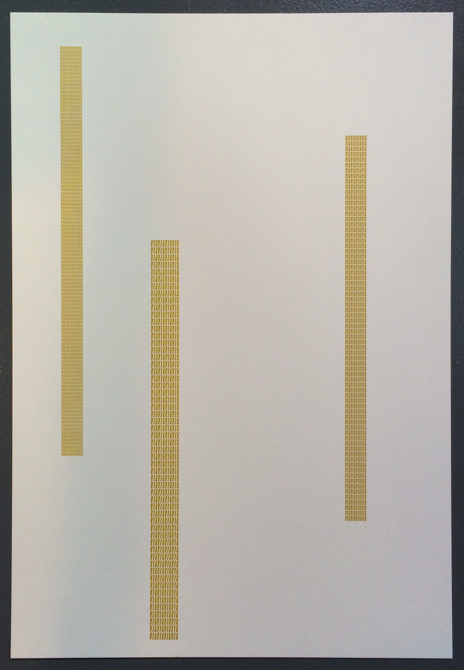
The metal type ornaments were set to the correct lengths, and arranged in position in the press bed. Each color is printed in a separate pass through the press. I first printed the ochre colored bars.
Fellow printers will note that I chose to lockup the type in a position where it would be easy to move the columns both up and down (with spacing material on either vertical side of the type) and right and left (with lots of long wood and metal furniture), easing setup of other printing passes.

First the ochre was printed, then the type was reconfigured in the press bed to print the gray color.
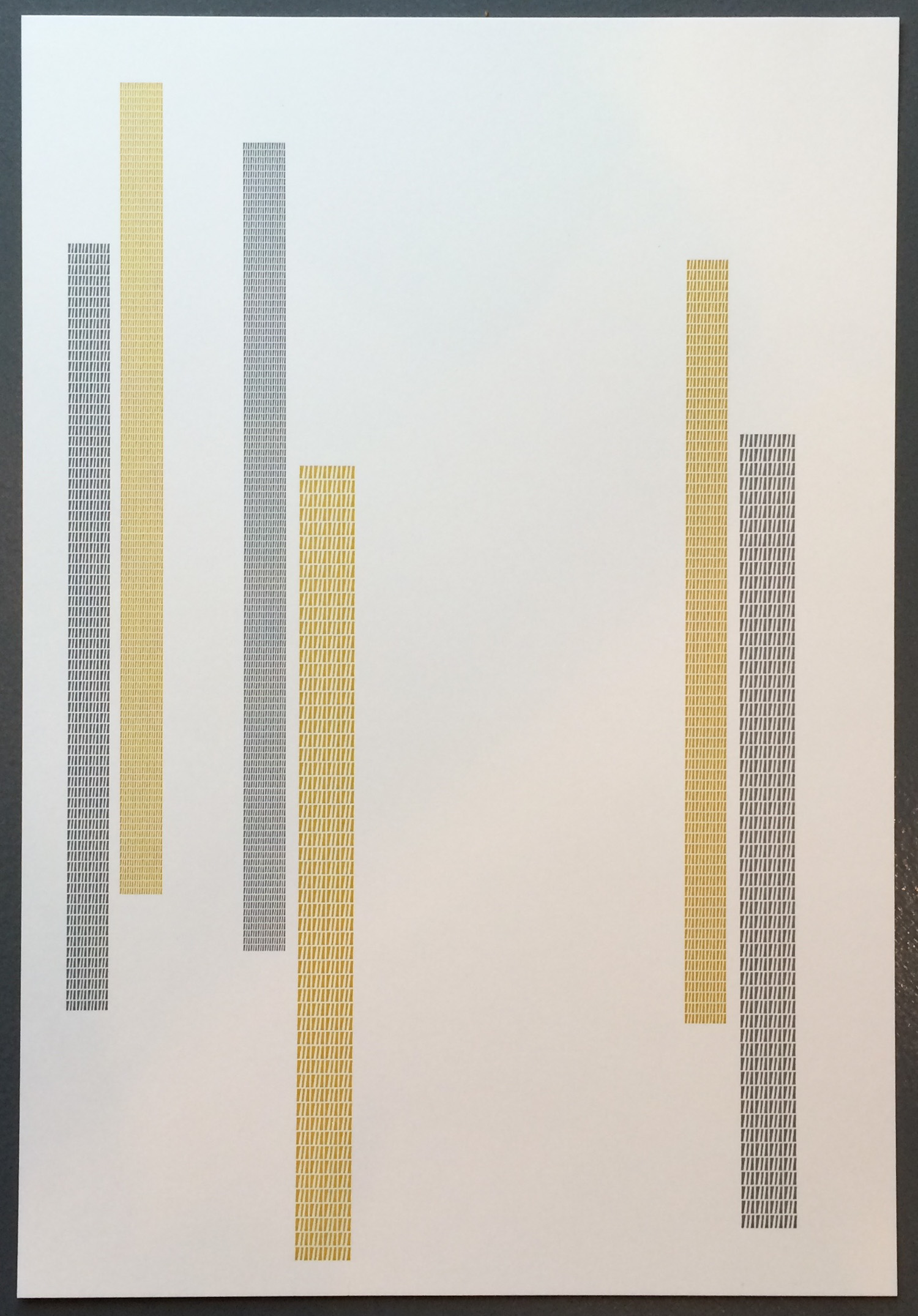
The print was coming along, but still had two other passes to go.
With each printing pass, things are never lined up perfectly the first time. Measurements were taken, type was moved, and reprinted until everything was in the right place.
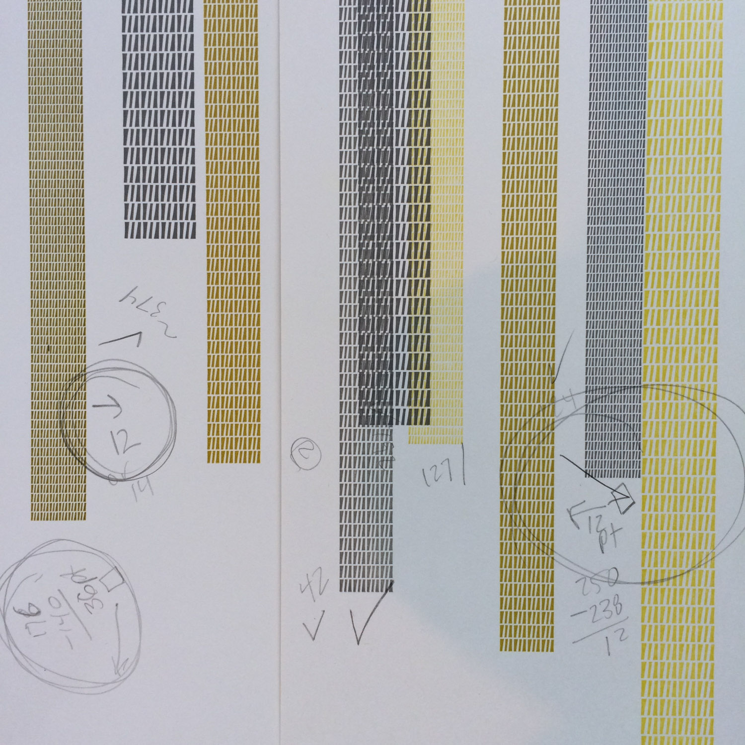
Here’s the third set of bars being printed.

With the geometric design complete, the poem text would come next. It was printed with a different process. The type layout was first designed on a computer…
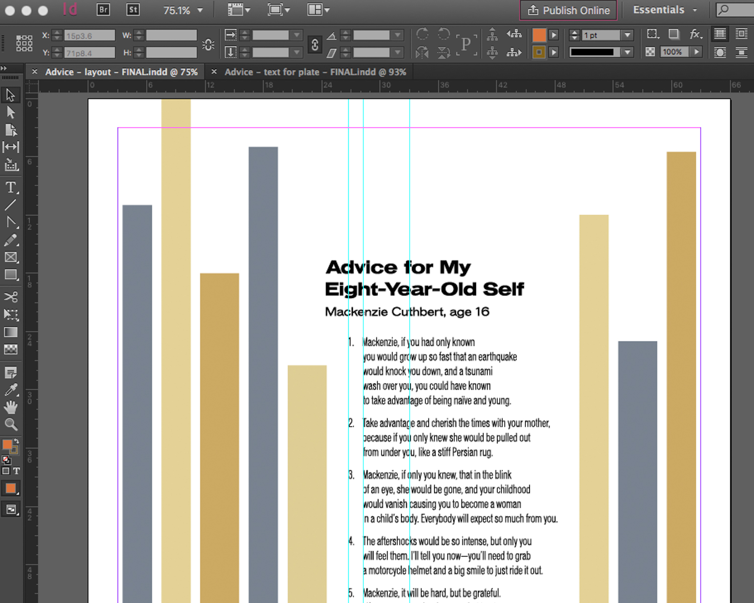
A computer file was sent to Boxcar Press and in return I received a polymer printing plate. We are all so thankful that Boxcar Press donates plates for the Children’s Hospital poetry broadside project, and has done so every year since the start of the program!
The plate is made of a polymer plastic where the image (in this case type) is a raised surface. The type is reversed on the plate, so that when printed it will be right reading. The plate is mounted on a metal base in the bed of the printing press.

The plate is inked by the printing press, and as the paper runs through the press, it is printed onto the paper.


That’s it! Pass four through the press was complete. For an edition of 110, I started with 120 pieces of paper. For those of you counting that meant that 120 pieces of paper through the press four times meant feeding paper through the press 480 times!
Here is the final trimmed print and a closeup.


This broadside is just one of twenty-three that were printed by other letterpress printers in the Seattle area. Sets of thebroadsides are put together in portfolios that were bound by the letterpress printers and led by master printer and bookbinder Jules Remedios Faye of Stern and Faye.
Thank you Mackenzie! It was an honor to print your words.
And always an honor to participate in this project. Thanks to poets Sierra Nelson and Ann Teplick who regularly work with these patients and Jenny Wilkson who forged this partnership between Seattle Arts & Lectures and the School of Visual Concepts letterpress community!
