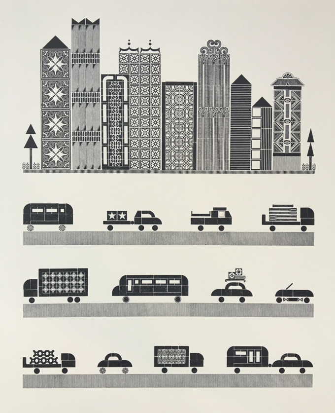
I've been wanting to print a follow-up to my Train Type piece for quite some time. Away the frenzy of a week-long workshop in a studio on the other side of the country, this follow-up print would be composed with my own type and printed in my own studio where I could take my time. Take my time, indeed! A year has flown by since the train composition, but the print I'm calling City Traffic is now completed. The finished composition shows a city skyline and rows of traffic. The entire composition is printed with handset metal type. The city buildings feature a variety of patterns and textures highlighting some of the best ornamental type at Pinwheel Press. The rows of traffic feature cars and trucks made out of geometric shapes with whimsical details. Lots of little details in this print make me smile.
The print is available for purchase at the end of this post, or continue on to learn about how it was created.
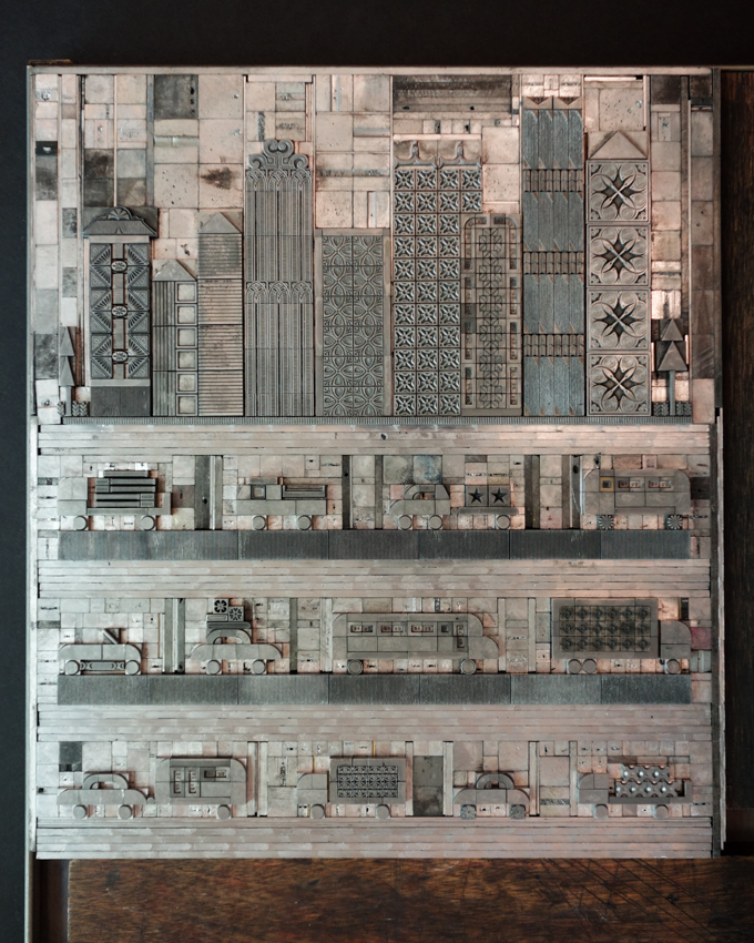
I started with creating the city skyline. I used metal type ornaments traditionally used as borders. Here the ornamental type was stacked in groups to make buildings, an exercise in contrasting textures and fitting type into a two-dimensional puzzle. There were many iterations of buildings to find type that worked together. Buildings that never made it into the print included overly ornate ornaments or those that didn't have a crisp outside edge to define the shape of the building.
There is a wide variety of ornamental type in the final type form. The ornaments for the city range from newly cast this year at Skyline Type Foundry to being cast over 100 years ago by various type foundries.

The traffic also took many iterations. At first the vehicles had very different looks, and it took awhile to find a "visual vocabulary" for the vehicles. In the end I preferred the solid geometric shapes of Skyline Type's Monoblox, which worked well with a solid 6pt border, and supplemented with miscellaneous ornamental type.

After I had decided on a style, I made many more cars and proofed them.

Here's the final type form of the city and the traffic.
In theory, a single color print like this can be printed with one pass on press, however this print needed three passes because of the type chosen.
Below is the first pass on press. You'll notice a couple of things... First, there is only two rows of traffic. This is because I didn't have enough of the linear type I chose for the "road." I would need to re-purpose this type from the first two rows, and print the third row of traffic in a later pass. Second, the far right (in the type form) building needed to be printed in a separate pass... more on that in a bit.
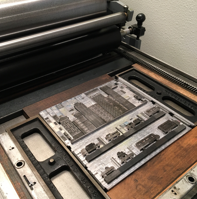
With type removed for later passes, here's the first pass print:

Note that the right-most building in the type form, is now the left-most building in the print. The roof was printed, but the type for the main part of the building needed to be printed next in a separate pass.
This beautiful type comes from the Stempel Type Foundry that operated in Germany up through the 1980s. The casting date of this specific type is unknown, but I've seen the design available in Stempel type catalogs from the 1920s. While type made for the US and British markets is .918" high, type for continental Europe is taller at .928" high. While .010" might not seem like a big difference, letterpress printing is like the fable Princess and the Pea-- even tiny things make a noticeable difference. The taller type can't be printed the same time as American type without it punching hard into the paper, damaging the print, and possibly damaging the type.

So a separate pass for the fancy German type:

Lined up exactly so that when added to the existing print, the building was in place underneath its roof:

Next, the third row of traffic. Linear "road" type was reused from the earlier printing pass, and the third row of traffic was printed.

To create this final print:

Overall I'm really pleased with the print. It took quite a bit of time to get the typesetting right, and longer on press with three printing passes, but to me the result was worth it.
Some of my favorite details:
- The car in the second row loaded up with packages on its roof.
- The car and Airstream-like trailer in the lower right.
- The trees on the edges of the city have trunks made from Roman column-like type. The type is quite scratched and adds to the illusion of a tree trunk. Living in the Pacific Northwest I had to include a lumber truck (top row, last vehicle), which of course had to be filled with the same Roman column-like "tree trunks."
- The Volkswagen-like Beetle (third row, second vehicle), and Vanagon (first row, first vehicle) have flowers for wheels as a nod to being cars from the era of Flower Power.
- The car towing stars (first row, second vehicle) is a nod to Fiat driving Jen Farrell of Starshaped Press who has created many a city with metal type.
Purchasing
City Traffic is available for purchase.
