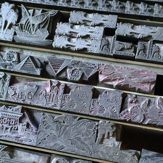
The Wells College Book Arts Center has a pretty amazing collection of type. As a student in their Wells Summer Institute program it was a real joy to see and work with such rare type. One of the jewels in their collection is a complete Egyptian Border designed by Herman Ihlenburg for MacKellar, Smiths, & Jordan, circa 1881. This style of border was short lived, only produced for about a decade, making it very rare today.

These cast type combination borders were created by type foundries to help printers compete with engravers and lithographers. Combined in different ways the type allows the printer to create little scenes. The Egyptian Border has type with palm trees, pyramids, temples, buildings, boats, tropical plants, people, and animals.
While it is not certain that MacKellar, Smiths, & Jordan was the first type foundry to design "combination borders," as the biggest foundry of its day they certainly embraced the idea and were well known for their combination borders. Besides the Egyptian Border they produced borders with nature and botanic themes as well as other "exotics" with Japanese and Chinese themes. For more on the history of MacKellar, Smiths, & Jordan in general or specifically their combination borders check out the Oak Knoll publication by Doug Clouse "MacKellar, Smiths & Jordan, Typographic Tastemakers of the Late Nineteenth Century."
MS&J's Egyptian Border "Series 92" came in three sections and the Wells Book Arts Center is lucky enough to have all three. Here is how they appeared in MacKellar, Smiths, & Jordan's 1892 catalog (click to view close up):


Above images courtesy of California Digital Library on Archive.org.
Thankfully each piece is cast on the point system, which was relatively new in the 1880s, so pieces are in typesetting-friendly sizes like 24 x 36 pts, or 6 x 18 pts. One of the trickier aspects of working with the border is that images are at different scales - foreground, mid-ground, and horizon. I needed to put together pieces of the same scale to make the image look realistic. More than once I used a magnifying glass to look at a piece of type to figure out how it could be used. The type catalog examples also proved a useful reference to create the below scene.

I featured type from the third section, but also used a border from the second section to create a colophon. The title in a circular quad arc and subtitle are type from Wells Book Arts Center's 19th century type collection.
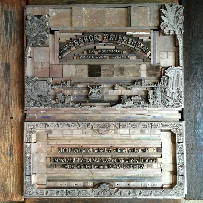
I printed the form on Mohawk Superfine softwhite paper with charcoal gray ink.

And here is the final print...
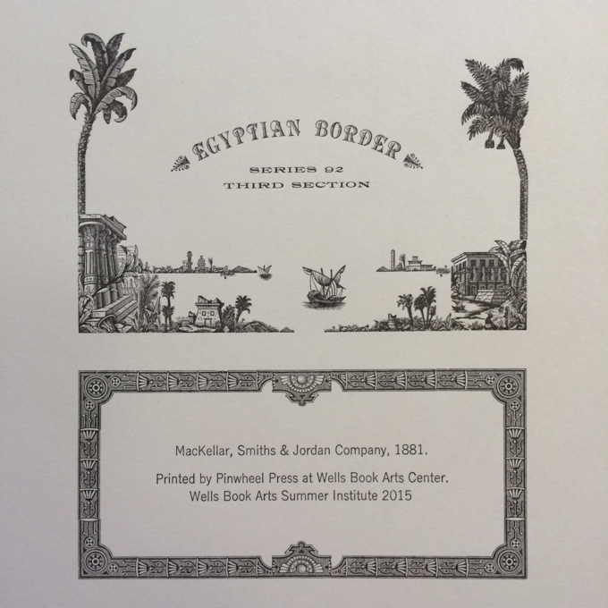
I'm really pleased with the result and it was truly a joy to work with such a type collection!
