Now in its seventh year, this project is a partnership between letterpress printers from the School of Visual Concepts and the Seattle Arts and Lectures’ Writers in the Schools (WITS) program. WITS poets Sierra Nelson and Ann Teplick regularly work with pediatric patients at Seattle Children’s Hospital, helping the young patients write poetry that expresses their individual experiences.
Once a year a select group of poems are chosen to be part of this project. This year 21 poems were matched with letterpress printers who created broadsides then bound in a portfolio.
I received a thoughtful poem created by two patients: an 11-year old named Curtis and a 16-year old named Brittney. The pair collaborated on the poem as part of an in-hospital classroom project led by poet Ann Teplick. For Curtis, Brittney, their families, and anyone else interested in this program, what follows is the process of how I printed the broadside for this poem.
I was drawn to the poem title "Coming Together and Breaking Apart" and wondered if I could show metal type ornaments literally coming together and breaking apart on the page, referencing the everyday and extraordinary experiences Curtis and Brittney write about in their poem. I chose simple shapes to better illustrate the motion. First I produced some test prints of ornaments to see which ones I liked.

I typeset the borders and did some quick proofs to play with layout and colors. The metal ornaments descend down the page breaking apart.I decided to set the poem in a favorite mid-century typeface named Venus. I now have several fonts of Venus, and had hoped to use metal type for the poem, but alas none of the point sizes I had on hand worked well. This pushed me in the direction of designing the type layout digitally and printing it with a polymer plate. And even though printing with polymer opened up the possibility to print any typeface available on the computer, for this design I liked that it was a typeface from the age of printing with metal, even if I would be printing it with plastic.
Below is my plan for the broadside. Cut out proofs of the type, aligned and glued down in the exact position that I want to print them. I first learned this technique from instructor Jenny Wilkson in my first letterpress class, and I still find it very useful today.

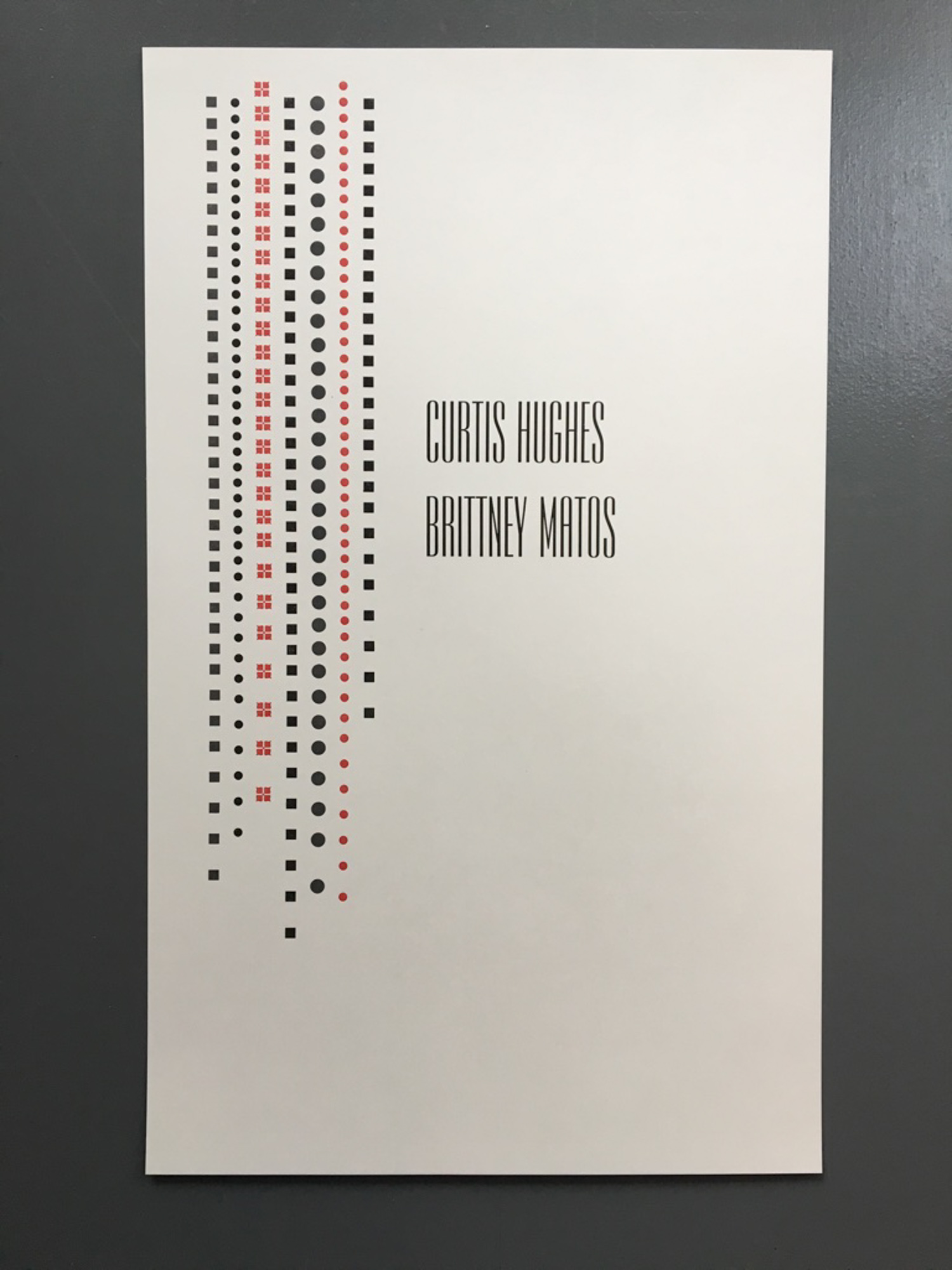
The poet names are shown large akin to the band name on a record album cover, something I learned from printer Ellie Mathews who often designs poetry broadsides this way to show who is the real star of the show. In this case I did have a font that would work-- a typeface named Empire in a large size.
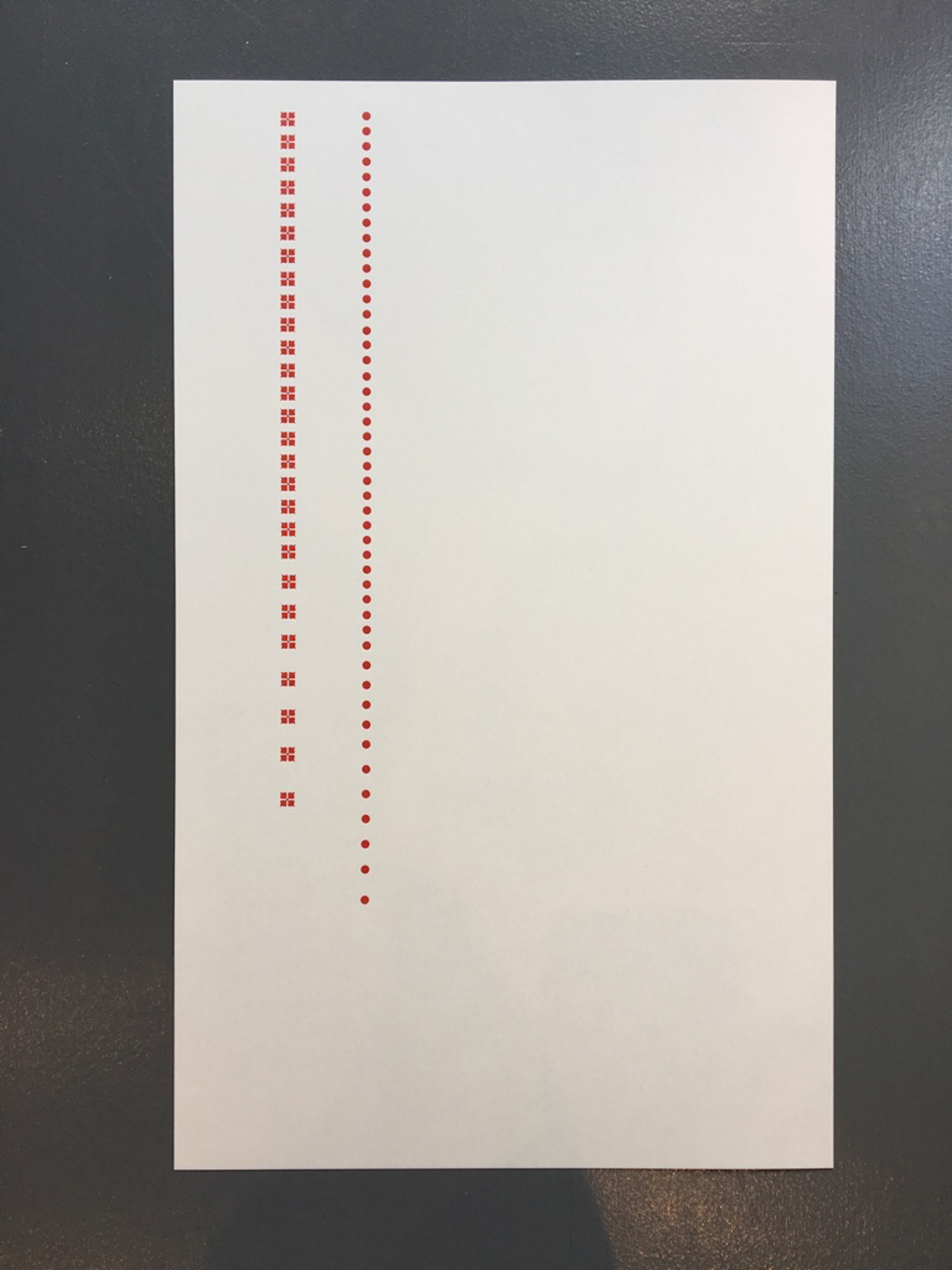
The metal type ornaments were set to the correct lengths, and arranged in position in the press bed. Each color is printed in a separate pass through the press. I first printed the red lines of ornaments.
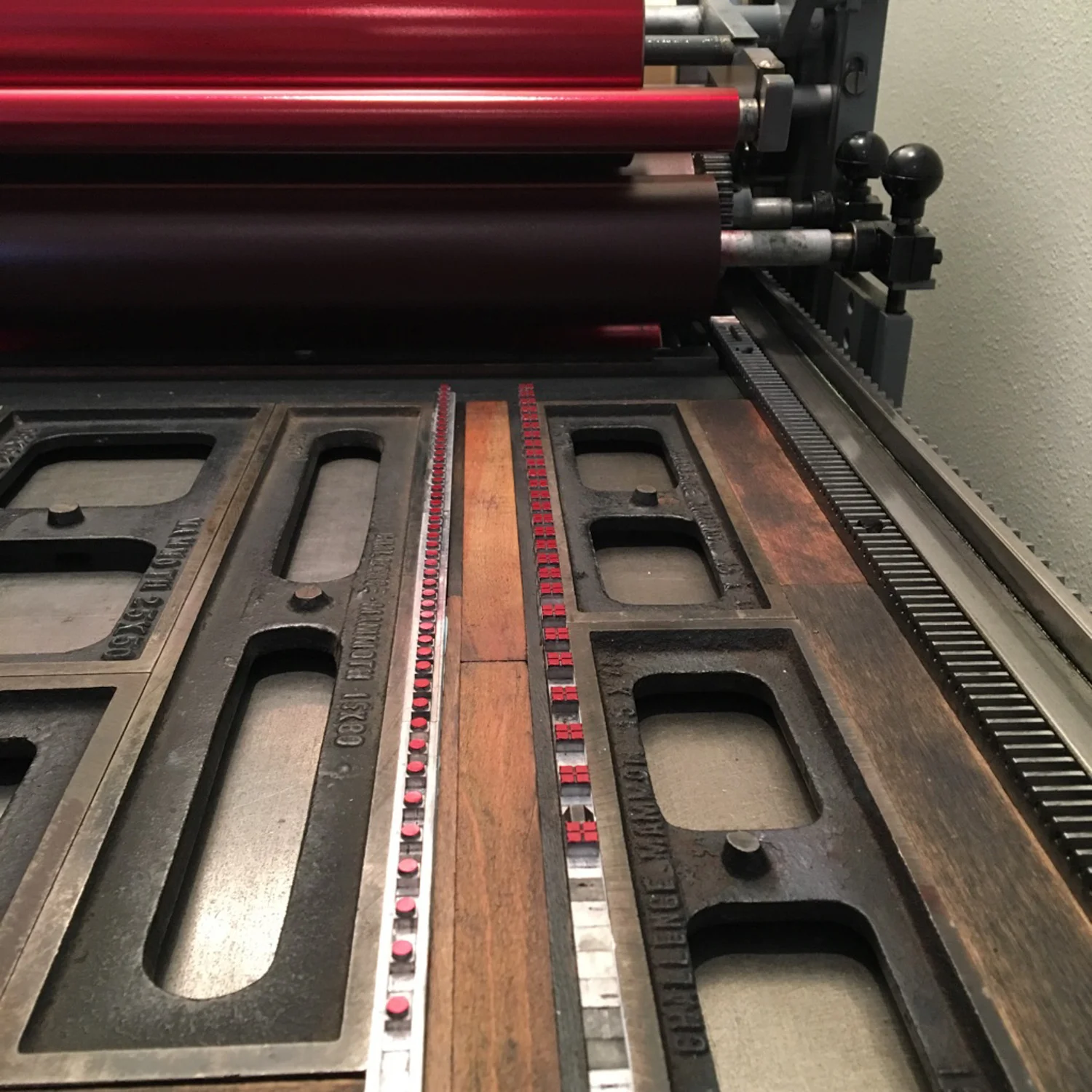

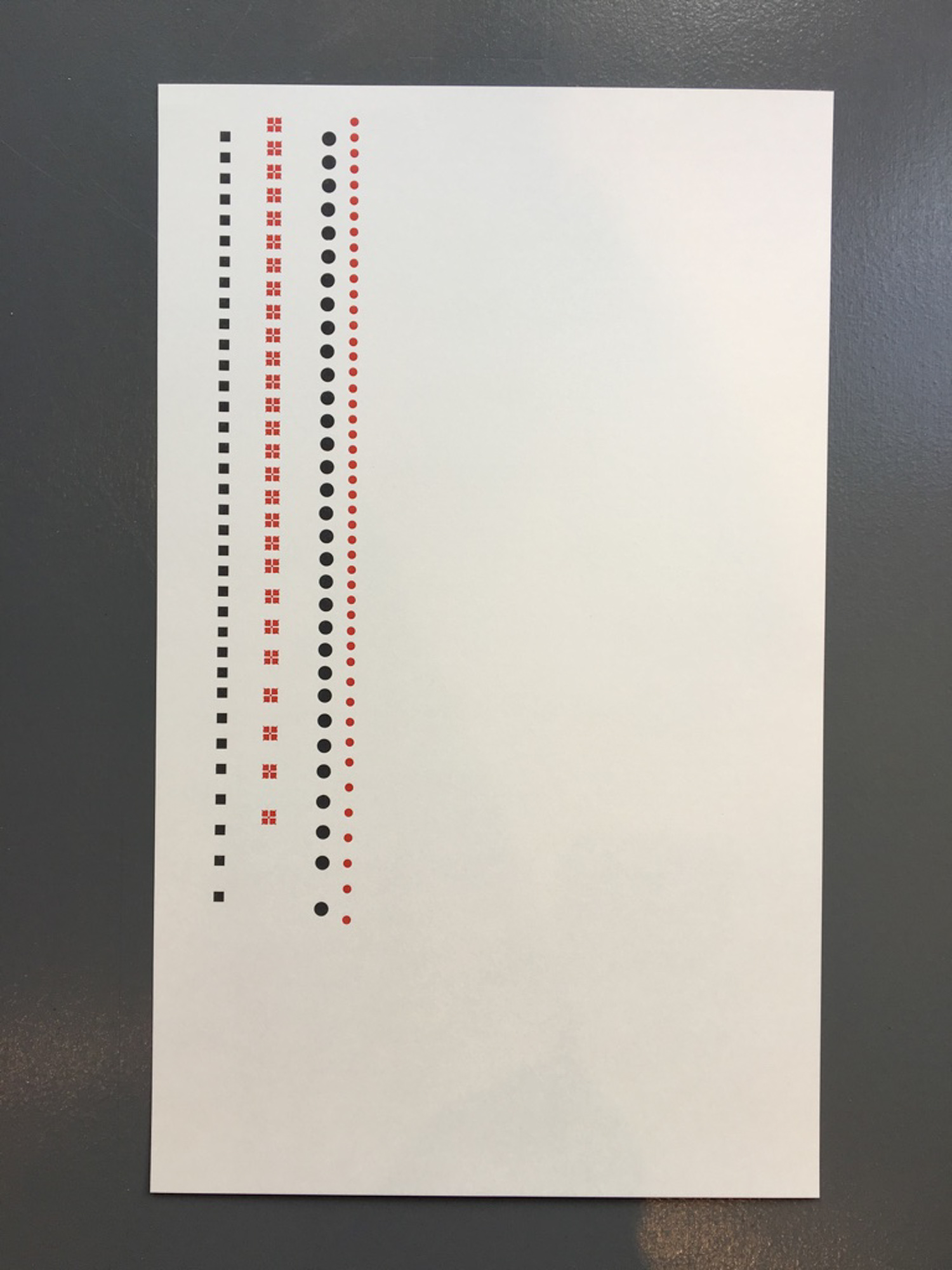
Next, two rows of gray ornaments. And then three rows of black ornaments with the poet names.


Here's a progression that shows what was printed on the page with each printing pass.
With the geometric design complete, the poem text would come next. It was printed with a different process. The type layout was first designed on a computer…

A computer file was sent to Boxcar Press and in return I received a polymer printing plate. We are all so thankful that Boxcar Press donates plates for the Children’s Hospital poetry broadside project, and has done so every year since the start of the program!
The plate is made of a polymer plastic where the image (in this case type) is a raised surface. The type is reversed on the plate, so that when printed it will be right reading. The plate is mounted on a metal base in the bed of the printing press.

The plate is inked by the printing press, and as the paper runs through the press, it is printed onto the paper.

That’s it! Pass four through the press was complete. For an edition of 120, I started with 130 pieces of paper. For those of you counting that meant that 130 pieces of paper through the press four times meant feeding paper through the press 520 times!
Lastly, once the ink had dried, the prints were trimmed down to their final size with the ornaments bleeding off of the top edge.

Here is the final trimmed print and a closeup.


This broadside is just one of twenty-one that were printed by other letterpress printers in the Seattle area. Sets of the broadsides are put together in portfolios that were bound by the letterpress printers and led by printer and bookbinder Bonnie Thompson Norman of Windowpane Press.

Thank you Curtis and Brittney! It was an honor to print your words.
And always an honor to participate in this project. Thanks to poets Sierra Nelson and Ann Teplick who regularly work with these patients and Jenny Wilkson who forged this partnership between Seattle Arts & Lectures and the School of Visual Concepts letterpress community!
