
Print Projects

It's back! Now in its eighth year, this project is a partnership between letterpress printers from the School of Visual Concepts and the Seattle Arts and Lectures’ Writers in the Schools (WITS) program. WITS poets work with pediatric patients at Seattle Children’s Hospital, helping the young patients write poetry that expresses their individual experiences.
Once a year a select group of poems are chosen to be part of this project. This year 21 poems were matched with letterpress printers who created broadsides then bound in a portfolio.

It's back! Now in its seventh year, this project is a partnership between letterpress printers from the School of Visual Concepts and the Seattle Arts and Lectures’ Writers in the Schools (WITS) program. WITS poets work with pediatric patients at Seattle Children’s Hospital, helping the young patients write poetry that expresses their individual experiences.
Once a year a select group of poems are chosen to be part of this project. This year 21 poems were matched with letterpress printers who created broadsides then bound in a portfolio.

"Truth and Lies" is a letterpress print created in response to the 2016 presidential election and the ongoing treatment of facts by the current administration. After reading post-election analyses about information bias, echo chambers, and disinformation campaigns, aside from being generally discouraged about the state of our country, I wondered whether I could create a print that could be viewed differently when looking through visual filters. It would first involve some experimenting...
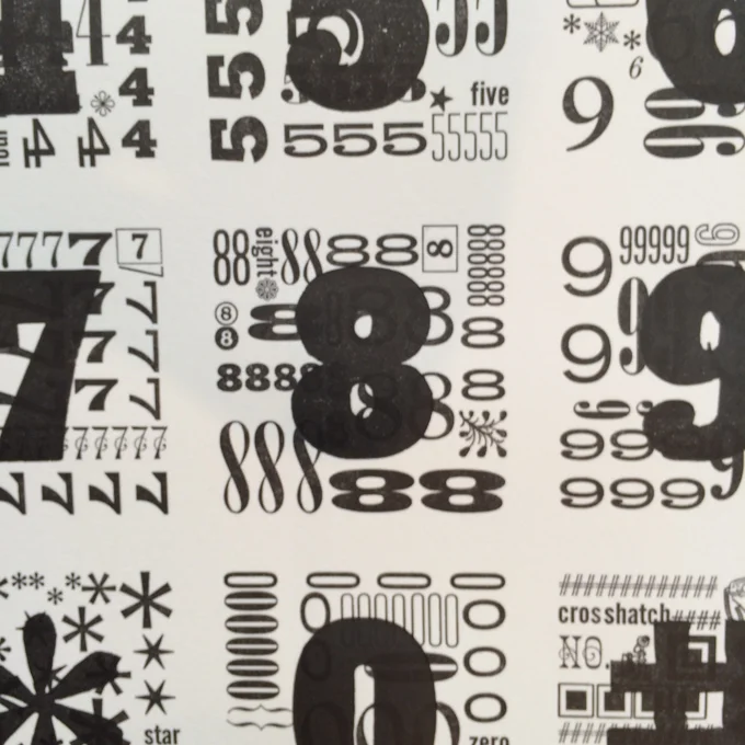
This is a print I created Winter Quarter of 2009 as a second quarter student at the School of Visual Concepts. I believe this was the third project I ever printed. It clearly didn't take me long to become nuts about typesetting and type.
I remember wanting it to be a celebration of typefaces in all their various shapes. 38 typefaces were used. It was quite a challenge to typeset, but I was determined. I loved that it was a puzzle to fit all the pieces together.
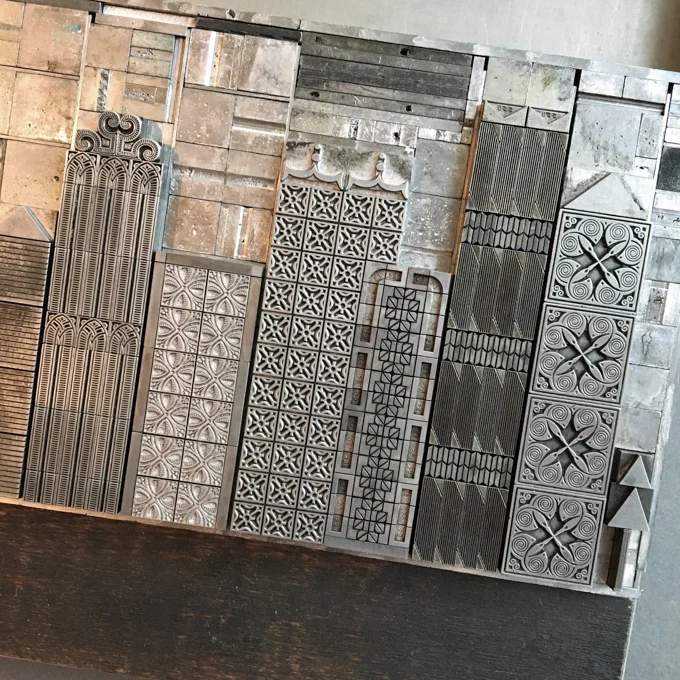
The print City Traffic shows a city skyline and rows of traffic. The entire composition is printed with handset metal type. The city buildings feature a variety of patterns and textures highlighting some of the best ornamental type at Pinwheel Press. The rows of traffic feature cars and trucks made out of geometric shapes with whimsical details. Lots of little details in this print make me smile.

Now in its sixth year, this project is a partnership between letterpress printers from the School of Visual Concepts and the Seattle Arts and Lectures’ Writers in the Schools (WITS) program. WITS poets work with pediatric patients at Seattle Children’s Hospital, helping the young patients write poetry that expresses their individual experiences.
Once a year a select group of poems are chosen to be part of this project. This year 23 poems were matched with letterpress printers who created broadsides then bound in a portfolio.
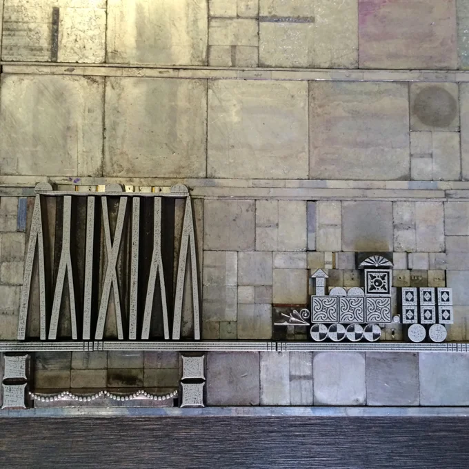
As part of my week-long class with Starshaped Press at the Wells Summer Institute, we worked on an assignment to create an architectural print out of type ornaments. The architecture could be based on something real or imagined. As a long time admirer of Starshaped Press' metal and wood type cityscapes I decided I would try my hand at one. But to mix it up I would also include something else and I settled on a train.
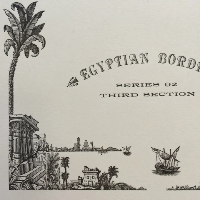
The Wells College Book Arts Center has a pretty amazing collection of type. As a student in their Wells Summer Institute program it was a real joy to see and work with such rare type. One of the jewels in their collection is a complete Egyptian Border designed by Herman Ihlenburg for MacKellar, Smiths, & Jordan, circa 1881. This style of border was short lived, only produced for about a decade, making it very rare today.
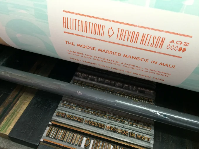
Now in its fifth year this project is a partnership between letterpress printers from the School of Visual Concepts and the Seattle Arts and Lectures' Writers in the Schools program. Pediatric patients work with poets Sierra Nelson and Ann Teplick to write poems as part of their stay at Seattle Children's Hospital. This is ongoing work for the poets who work with the patients. At year end a select group of poems are chosen to be illustrated in broadsides by letterpress printers and are bound in a portfolio.

he School of Visual Concepts has a really nice collection of metal type ornaments. I’ve been wanting to work more with the borders specifically and decided to print a sampler– mostly for the sheer fun of seeing what they all look like, but also as a resource for future projects.
I poked through the collection and chose borders that I especially wanted to see printed, and then moved on to others that showed the variety of the collection. Many of the borders are designed to be used in different combinations and directions. I believe most of them have been typeset in a traditional way, but in some cases I doubled or tripled up a line for aesthetic reasons.
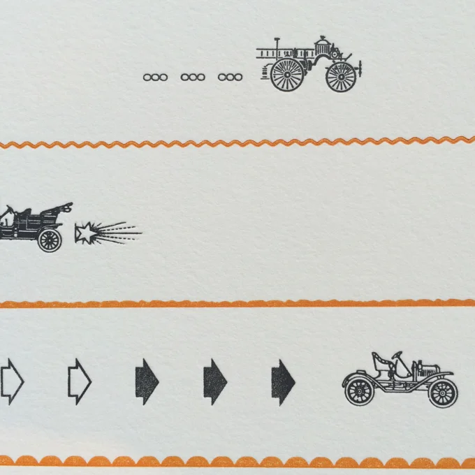
This card was inspired by a new acquisition of ornaments for the type collection of the School of Visual Concepts. They were... old-timey cars!
